In the last article, I mentioned we’d be diving into block styles, style variations, and block variations. I even used the word “vs”, but honestly, that’s a bit misleading! These three things aren’t competing with each other. They solve different problems and you can use only one of them or all three in the same theme.
So let’s break down what each one actually does, when to reach for it, and how it looks in the editor.
Block Styles
What are they?
A block style is a named visual variant of a block. When a user selects one, WordPress adds a CSS class to that block and your theme’s CSS does the rest.
Think of it like this: the Button block has a default “Fill” style and an “Outline” style built in. Block styles are exactly that, but ones you define for your theme.
This is really handy when your design has multiple versions of the same block. For example:
- Three different button styles
- Four different link treatments (inline paragraph links, footer nav links, etc.)
- Headings that have a specific decorative style used throughout the site
- A Cover block variant styled to match your hero section design
Instead of asking editors to manually add CSS classes, block styles give them a one-click option right inside the editor.
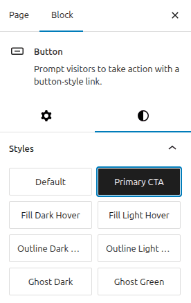
How does it look in the editor?
When a block has registered styles, a Styles panel appears in the right-hand sidebar when that block is selected. The user just clicks the style they want without having to manually add a class name to the block.
How do you register one in your codebase?
You can register block styles in three ways: via PHP, JavaScript, or JSON (in theme.json).
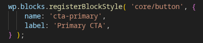
JavaScript
PHP
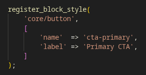
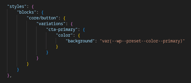
Both ways register a style called cta-primary for the Button block. WordPress will automatically add the class is-style-cta-primary to the block’s wrapper when selected.
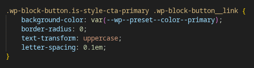
Then in your CSS:
JSON (via theme.json) – only for simple style variations that don’t need extra CSS:
-> Which to use? PHP is the most straightforward for most cases. Use JavaScript if you’re already working with a build process and prefer JS for block-related logic. Use theme.json if the style is purely about design tokens (colours, spacing, typography) and no custom CSS selectors are needed.
Style Variations
What are they?
A style variation is a completely different visual theme on top of your theme. It swaps out colours, typography, spacing – the whole look – without changing any templates or structure.
Think of your theme as a room and style variations as different paint jobs, furniture sets, and lighting options for that same room. The layout stays the same; the aesthetic changes entirely.
This is great for:
- Offering a dark mode alongside your default light theme
- Providing seasonal or campaign-specific colour schemes
- Giving clients multiple approved visual options without maintaining separate themes
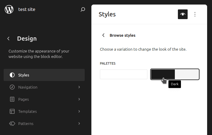
How does it look in the editor?
Style variations live in the Site Editor → Styles panel (the paintbrush icon). Users can preview and switch between them there. FSE users can browse and apply them without having to edit any theme files.
How do you create one?
A style variation is a JSON file that lives in your theme’s styles/ folder. It follows the same structure as theme.json, but only needs to include the values you want to override.
my-theme/
└── styles/
├── dark.json
└── high-contrast.json
For example, styles/dark.json might look like:
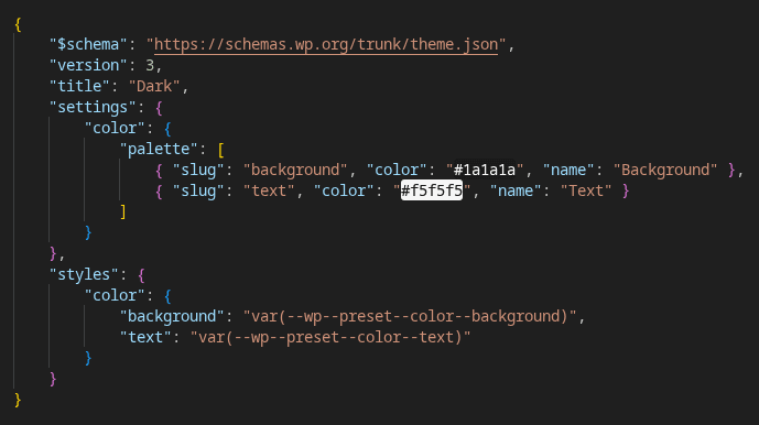
WordPress picks these up automatically; no additional registration needed. Just drop the file in the styles/ folder and it appears in the Site Editor.
-> A note on scope: Style variations affect the whole site. If you need to vary the look of just one block, that’s a block style (see above). If you need to vary the structure or behaviour of a block, that’s a block variation (see below).
Block Variations
What are they?
A block variation is a preconfigured version of an existing block with its own name, icon, description and default attributes or inner blocks included.
It shows up in the block inserter as if it were its own block, but under the hood it’s just a core block with a head start.
This is powerful because you get to leverage everything a core block already does – its existing functionality, its editor integration, its query capabilities – and extend it to match your specific needs.
Real examples of where this can be used:
- I have a section that uses two images and text side by side, but the Media & Text block only supports one image. It would be great if I could have two! → Create a variation using the Columns block with your two-image layout pre-built, ready to insert in one click.
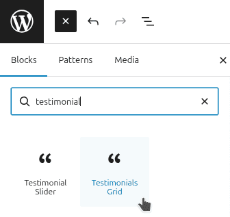
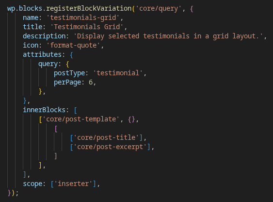
- I have a testimonial grid that needs to pull from a custom Testimonials post type, display results in a grid and let users hand-pick which testimonials to show. The Query Loop block defaults to Posts and doesn’t quite do what I need. It would be great if it could! → Create a Query Loop variation – combined with a Columns or Group block for the grid layout – that reads from the Testimonials post type and lets editors select exactly which testimonials to display.
- I want an article slider that works like the Query Loop but renders as a slider with navigation controls instead of a grid. Now I can have that too! → Same idea – a Query Loop variation, with the Interactivity API handling the slider behaviour on top.
How does it look in the editor?
Block variations appear in the block inserter alongside core blocks. They can have their own icon and description, so they look and feel like purpose-built blocks to the editor. Once inserted, they behave like the core block they’re based on, so editor users still have all the familiar controls.
How do you register one?
Block variations are registered with JavaScript:.
Here’s a simplified example – a Query Loop variation for a Testimonials post type:
-> Block variation vs custom block: If a core block can get you most of the way there, a variation is almost always a more convenient choice. You automatically get the existing structure and any improvements WordPress makes to that block in the future. Only reach for a fully custom block when you need functionality that simply doesn’t exist in any core block: things like complex API integrations, custom data from an external source or highly specialised interactive UI that has no core block equivalent.
So, which one do you need?
Here’s a simple way to think about it:
- “I need this block to look different” → Block Style
- “I need the whole site to look different” → Style Variation
- “I need this block to behave differently or start preconfigured” → Block Variation
And remember, you’re not choosing between them. A real-world theme will likely use all three.
A note on enqueuing your scripts
The JavaScript files we’ve referenced in this article (for registering block styles and block variations; not for any frontend functionality using the Interactivity API) need to be available in the block editor. That makes sense when you think about it: block styles need to appear in the Styles panel and block variations need to show up in the block inserter. If the scripts aren’t loaded in the editor, neither will appear.
If your built JS is already enqueued with wp-blocks and wp-dom-ready as dependencies, it will just work. If you want to be explicit about only loading it in the editor (and not on the frontend), you can enqueue it separately using the enqueue_block_editor_assets hook.
What’s Next?
In the next article, we’ll look at navigation in block themes: how to create and edit menus in the Site Editor, and how to use them in a header template part.
Got questions about block styles, variations or anything else? Drop a comment below!